


Misty Blue Abstract 3D Textured Oil Painting
ARTWORK DETAILS
• Availability: Made-to-order. 100% hand-painted by artists.
• Framing: Rolled canvas/Stretched frameless/Stretched framed
• Material: Professional oil/acrylic paints. High-quality linen canvas.
• Customization: Custom sizes, colors, and styles are available. Please contact us at contact@oilcreator.com for a quote. We will reply within 24 hours.
• Subject: Abstract
• Style: 3D Textured Art
Trusted secure payment, currently accept major credit cards (VISA, Mastercard, AMEX, etc.) and PayPal. Fortified with advanced SSL encryption technology, provides a reliable shield to safeguard your sensitive personal and financial information.
Upon delivery of the goods, you will promptly examine them. If any of the goods ordered have been damaged in transit or have been incorrectly shipped, does not meet your requirements or are defective through faulty material or factory workmanship. Please kindly notify us by writing to us through email at contact@oilcreator.com within 30 days from the date of delivery of the relevant goods.
What fascinates me most is the way the colors seem to overlap and break apart across the surface. The rough, layered appearance gives the artwork so much depth. I keep discovering interesting little details.
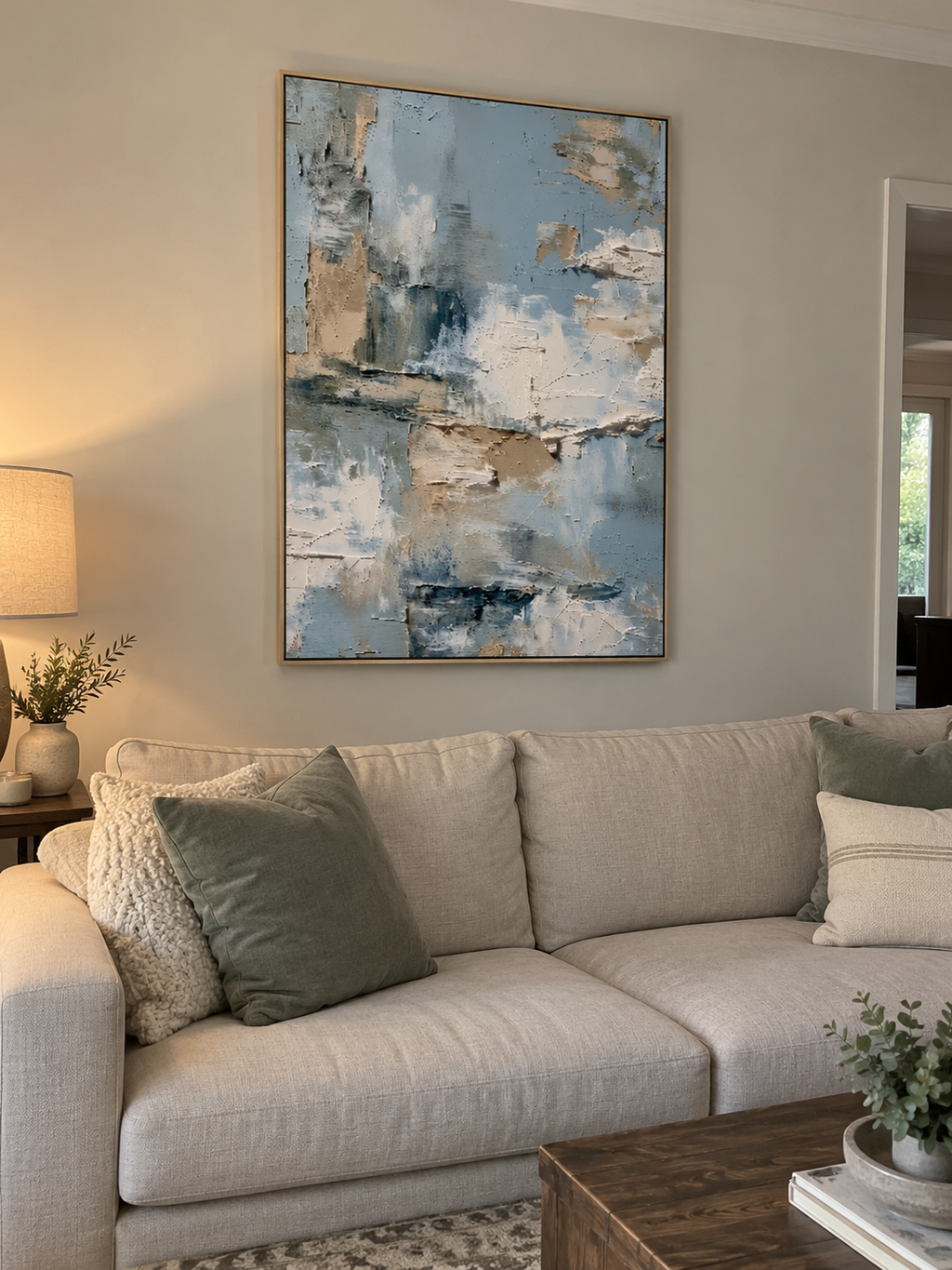
The lighter sections are quite subtle, and I found that natural daylight really brings out the contrast between the blue and beige layers. It's a little more understated than I expected, but that softness is part of its charm.
There's something incredibly soothing about the soft blue tones mixed with warm cream and sandy beige. I love how the darker brushstrokes add just enough contrast without taking away from the peaceful feeling of the painting.
What makes this artwork special to me is how effortlessly the colors work together. The weathered textures, soft blue tones, and warm neutral accents create a piece that feels both contemporary and timeless.
I especially enjoy the way the blue-gray strokes move through the softer cream areas. Nothing feels rigid or overly planned. The loose arrangement gives the painting a beautiful sense of freedom and movement.
Our living room has mostly white furniture and natural wood accents, and this painting brings everything together beautifully. The subtle blue and neutral colors add interest without making the space feel busy.
Every time I look at this painting, it reminds me of the ocean on a cloudy morning. The soft blues, pale whites, and sandy patches create such a calming atmosphere. It's a beautiful interpretation of nature without being literal.
I really appreciate how the cool blue-gray tones are balanced by those warmer beige sections. It keeps the painting from feeling cold or distant. The whole composition has a natural, comfortable elegance.
Some abstract paintings feel a little too busy for my taste, but this one has a wonderful sense of balance. The open areas of pale blue give your eyes somewhere to rest, while the darker marks add personality.
At first glance, I noticed the beautiful blue palette. Looking more closely, I started appreciating the irregular edges, overlapping colors, and delicate changes in texture. There's so much more going on than you initially realize.
The blue tones have a slightly cooler appearance than I expected, especially in the evening. I actually love how they look alongside our warm wood furniture. The contrast gives the room a really polished feel.
This painting has such an airy, relaxed quality. The pale colors remind me of a bright morning after the rain, with little hints of darker blue scattered throughout. It's simple, refreshing, and incredibly easy to enjoy.
I tend to choose artwork with neutral colors and interesting textures, so this immediately caught my attention. The combination of soft blue, cream, and muted taupe feels sophisticated without being too formal.
Those uneven layers and slightly distressed-looking sections are my favorite details. They give the painting character and make it feel less predictable than a smooth, perfectly blended abstract. The effect is wonderful.
There's something about the horizontal movement of the darker blue marks that feels almost like reflections on water. The surrounding pale colors create a lovely sense of openness. It has such a gentle presence.